New Taipei City

OVERVIEW

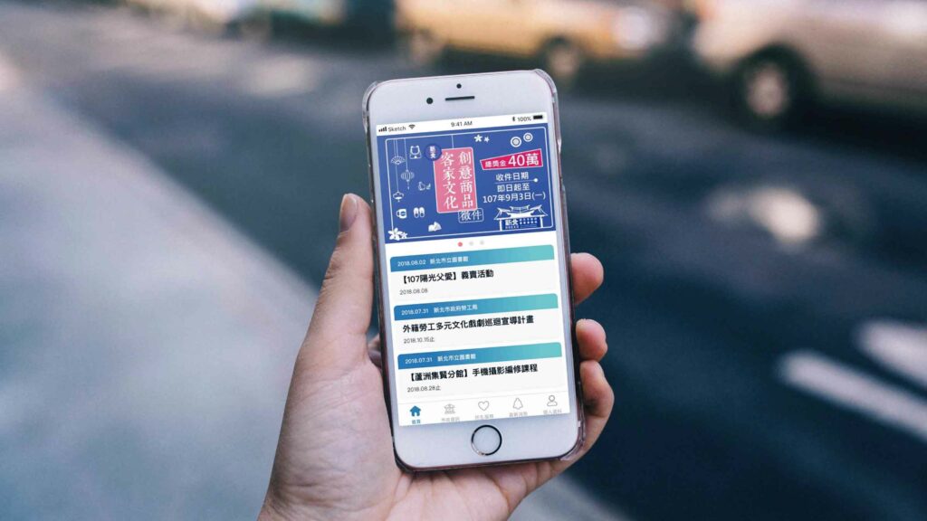
This is an existing app designed to enhance convenience for people living in New Taipei City, Taiwan. I have been keeping an eye on social issues and social design. To strengthen communication between the public and the government, I have included my thoughts on how to redesign this app as a means of communication. Previously, the app included significant amount of functions that were disorganized. This project reflects the action of identifying problems with the existing app, planning, then redesigning the app to make improvements.

My Contributions.

➤ User Flow

➤ Wireframe

➤ Prototype

➤ User interface upgrade

➤ User experience research

Award.

Shortlisted for Golden Design Award – UI Visual Design

Design

Kai-Hsu Sun

Duration.

2019

Tools.

Sketch 

Pain Points Analysis

01.

Item labeling was unclear.

02.

The use of color was inconsistent.

03.

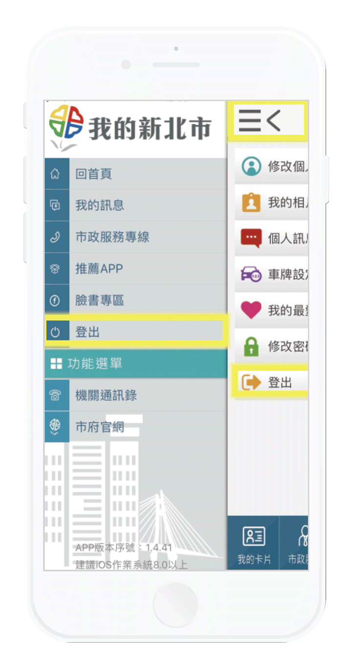
IOS system does not comply with the guidelines.

Home

Does not qualify for design guideline.

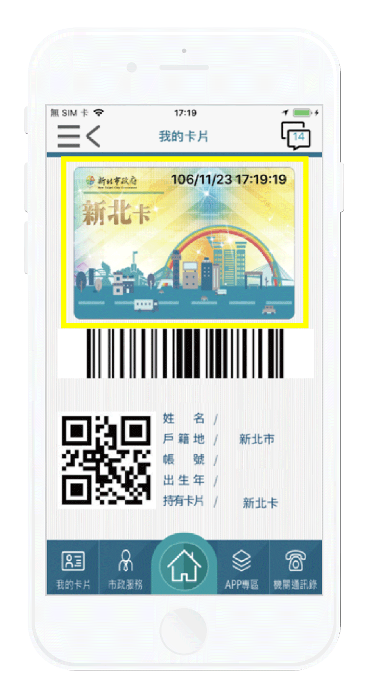
My Card

Complex Functions.

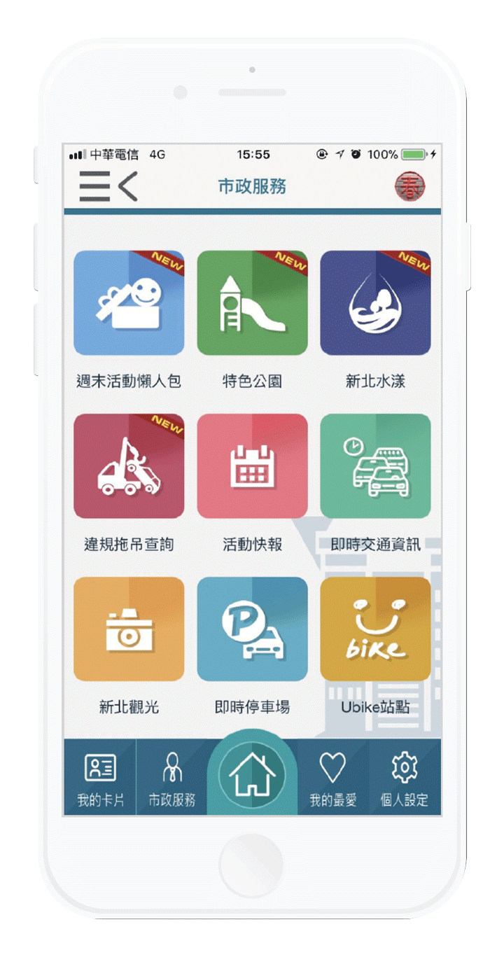
Service

Too many services do not have a unified use of standards.

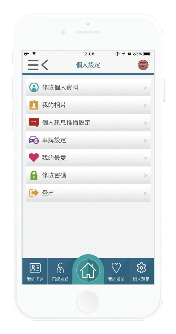
Setting

No integration function.

Service

Too many services do not have a unified use of standards.

Setting

No integration function.

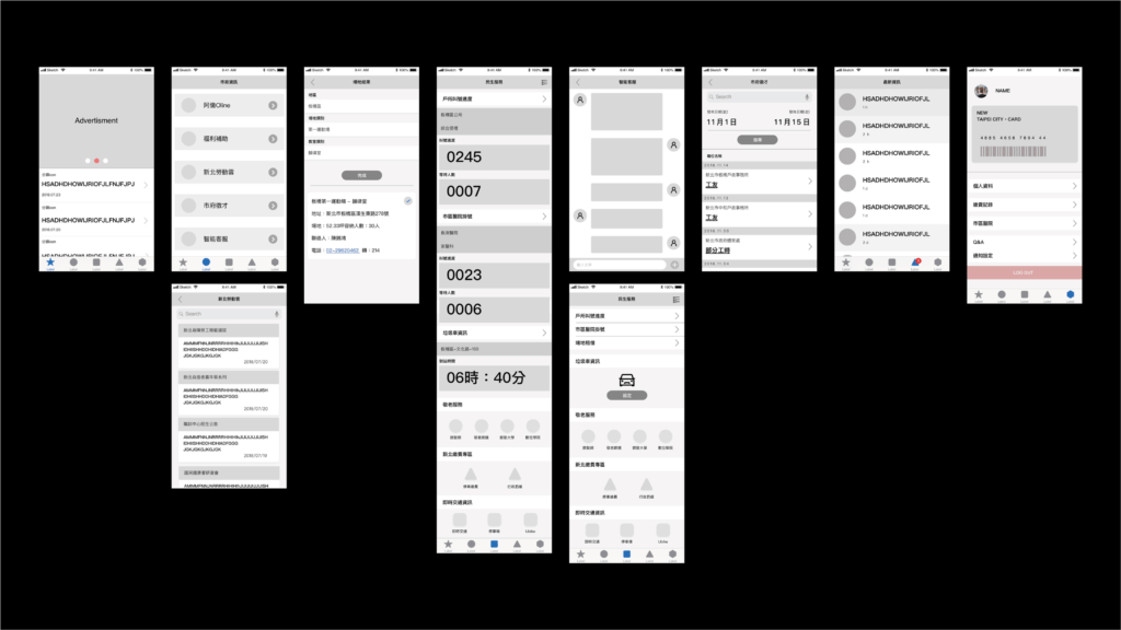
Wireframe Redesign

Reintegrated the functions to increase user experience.

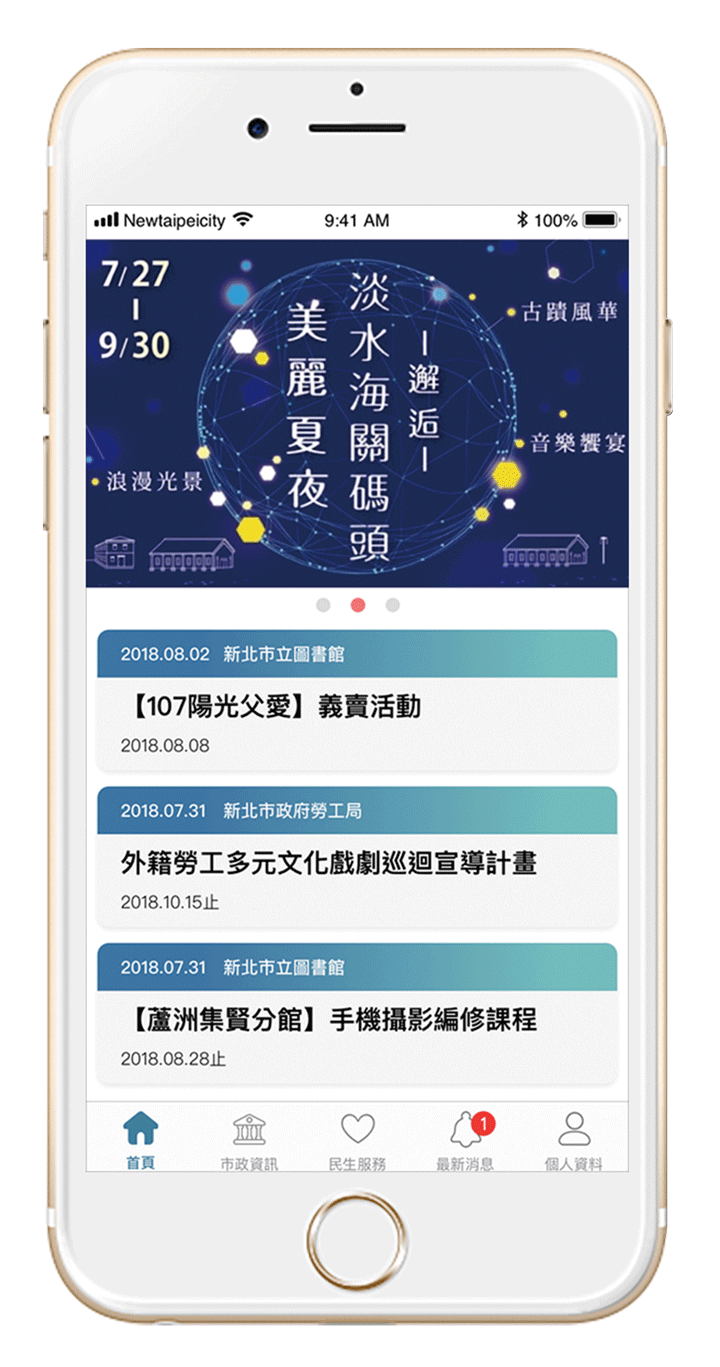
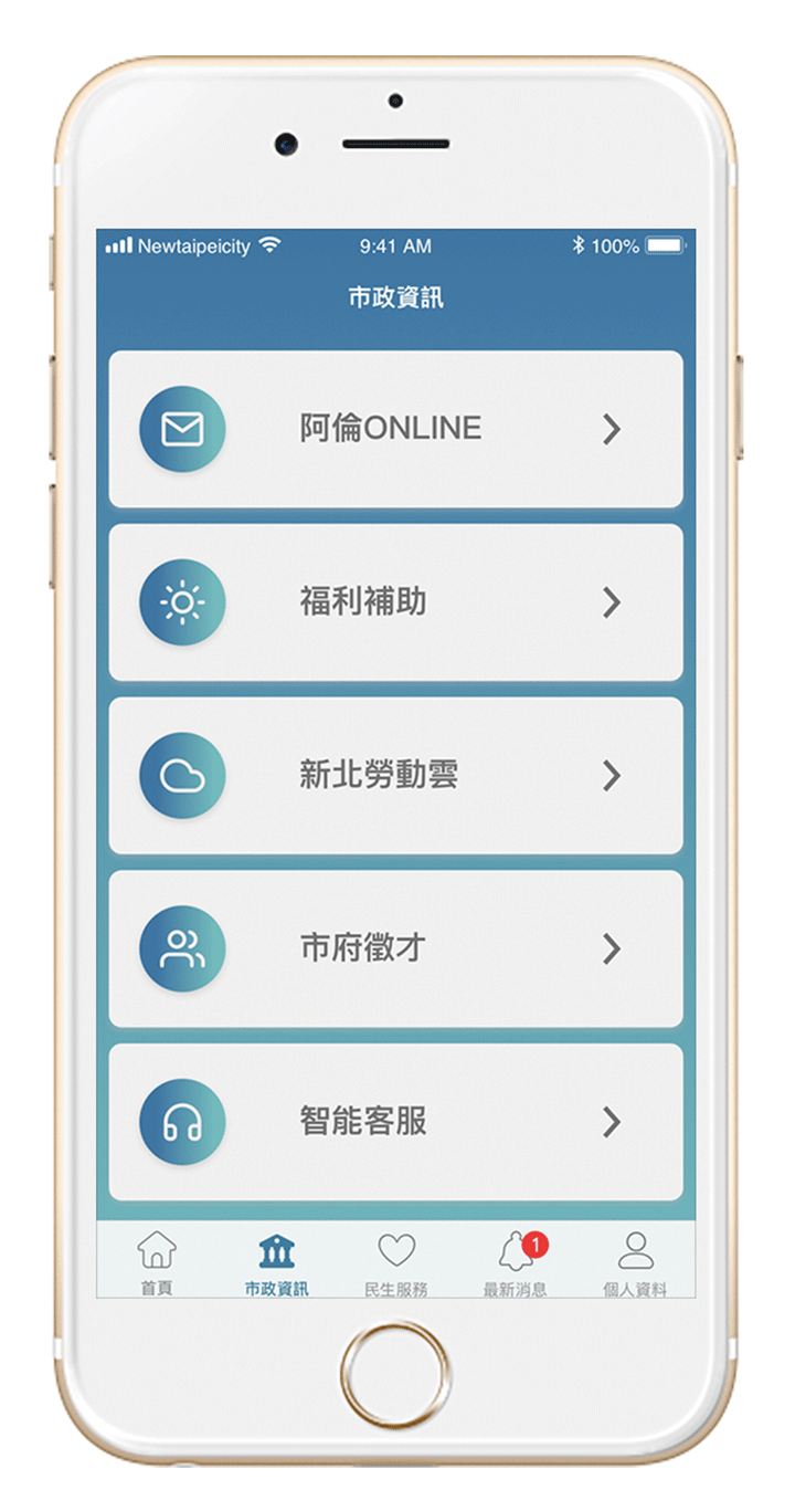
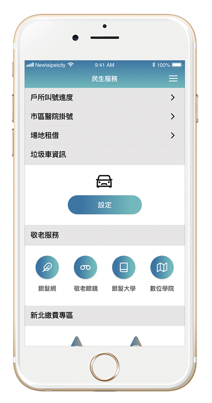
Based on the pain points, I updated the usage of the UI-User interface, reintegrated item categories, and redesigned the use of color. Additionally, I retained information and services that are helpful, and removed functions that may be replaced by other apps.

Guidline

Re-integrated IOS guidline and fixed icon.

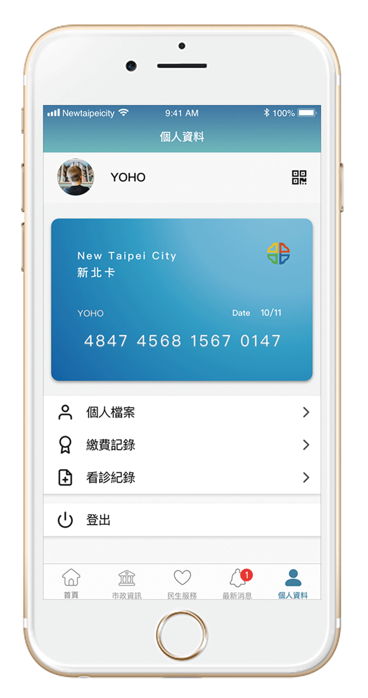
My Card/ Setting

1. Redesign “New Taipei city Card”
2.Integrated the code sections

Government News

Integrate the government News to facilitate citizen to check.

Service

Integrate the government service functions.

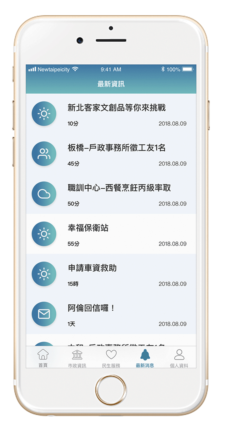
Notifications

Gathering any notifications of the application.

conclusion

Through comprehensive research and analysis, we have undertaken the re-planning of the Taiwan government’s app. Our goal is to create a project that will serve as a foundation for future redesigns, empowering the government to offer enhanced digital services to its citizens. By providing a user-centric and efficient app, we aim to ensure that citizens can enjoy better digital services and a more seamless user experience in the future.

New Taipei City

OVERVIEW

This is an existing app designed to enhance convenience for people living in New Taipei City, Taiwan. I have been keeping an eye on social issues and social design. To strengthen communication between the public and the government, I have included my thoughts on how to redesign this app as a means of communication. Previously, the app included significant amount of functions that were disorganized. This project reflects the action of identifying problems with the existing app, planning, then redesigning the app to make improvements.

My Contributions.

➤ User Flow ➤ Wireframe ➤ Prototype
➤ User interface upgrade
➤ User experience research

Awards.

Shortlisted for Golden Design Award – UI Visual Design

Duration.

2019

Tool.

Sketch

Pain Points Analysis

● Item labeling was unclear.

● The use of color was inconsistent.

● IOS system does not comply with the guidelines.

HOME

Does not qualify for design guideline.

My Card

Complex Functions.

Service

Too many services do not have a unified use of standards.

Setting

No integration function.

Wireframe

Reintegrated the functions to increase user experience.

Based on the pain points, I updated the usage of the UI-User interface, reintegrated item categories, and redesigned the use of color. Additionally, I retained information and services that are helpful, and removed functions that may be replaced by other apps.

Guidline

Re-integrated IOS guidline and fixed icon.

My Card/ Setting

1. Redesign "New Taipei city Card" 2.Integrated the code sections

Government News

Integrate the government News to facilitate citizen to check.

Service

Integrate the government service functions.

Notifications

Gathering any notifications of the application.

Conclusion

Through comprehensive research and analysis, we have undertaken the re-planning of the Taiwan government's app. Our goal is to create a project that will serve as a foundation for future redesigns, empowering the government to offer enhanced digital services to its citizens. By providing a user-centric and efficient app, we aim to ensure that citizens can enjoy better digital services and a more seamless user experience in the future.