FIREFOX LITE APP

OVERVIEW

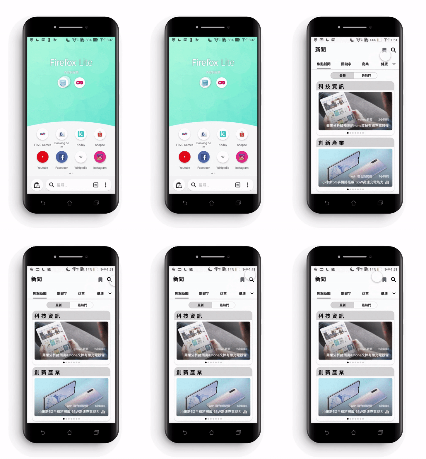
This is a Ul/UX project proposal in which my master's program collaborated with Taiwan Mozilla in December 2019. We worked in groups and assisted Mozilla launch the Firefox lite mobile app, which is mainly used by Android users. My group focused on examining the news function in the app and provided comments for improving the existing news function.

Duration

2019

My Contributions.

➤ User Flow ➤ Wireframe
➤ User Interview ➤ Persona research

Collaboration.

Mozilla, Taiwan

Team.

4 members

Tools.

Sketch, Adobe XD

Target Audience

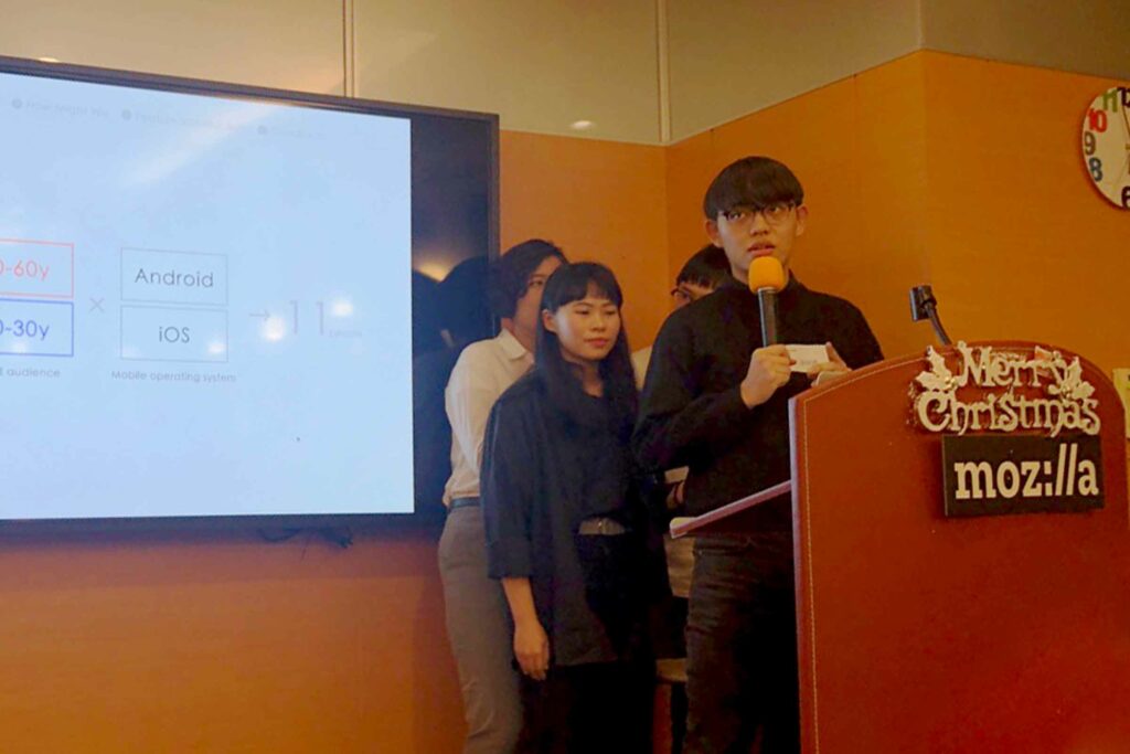
Firstly, the most prominent user age groups for this app are between 20 to 30 years old and 50 to 60 years old. Moreover, it requires operation on two different mobile platforms, namely iOS and Android. Lastly, our study included a total of 11 participants, comprising two age groups: 20 to 30 years old and 50 to 60 years old, with 6 participants using iOS and 5 participants using Android as their respective operating systems.

iOS

Android

AGE 20 - 30​

PAIN POINTS​

● Information homogeneity
● Unable to receive instant breaking news
● Too many advertisements
● Too many pop-up windows, operation procedure is not fluent
● Existing apps fail to satisfy users expectation
● App news is not objective (worry about political polarization)
● Unable to track news on specific topics

USER NEEDED​

● Category customization
● Browsing history
● Simple and clear interface design

AGE 50 - 60​

PAIN POINTS​

● Font is too small to enlarge
● Too many advertisements
● Function is not noticeable
● Information is too restrictive and narrow
● Unable to know the time sequence of news
● Prolonged screen time on mobile phones

USER NEEDED​

● Read news aloud function
● Time sequence of news release
● Font and image zoom function

Persona Research

After our previous user research, we used "Persona" to establish two distinct user groups with specific usage scenarios.

Mind Map

After conducting the Persona research, we transformed it into a Mind Map. This was done to gain insights into potential issues and emotions that users might encounter during their interactions with the product.

How Might We

How might we improve the comfort and efficiency of reading News?

Feature Fuction

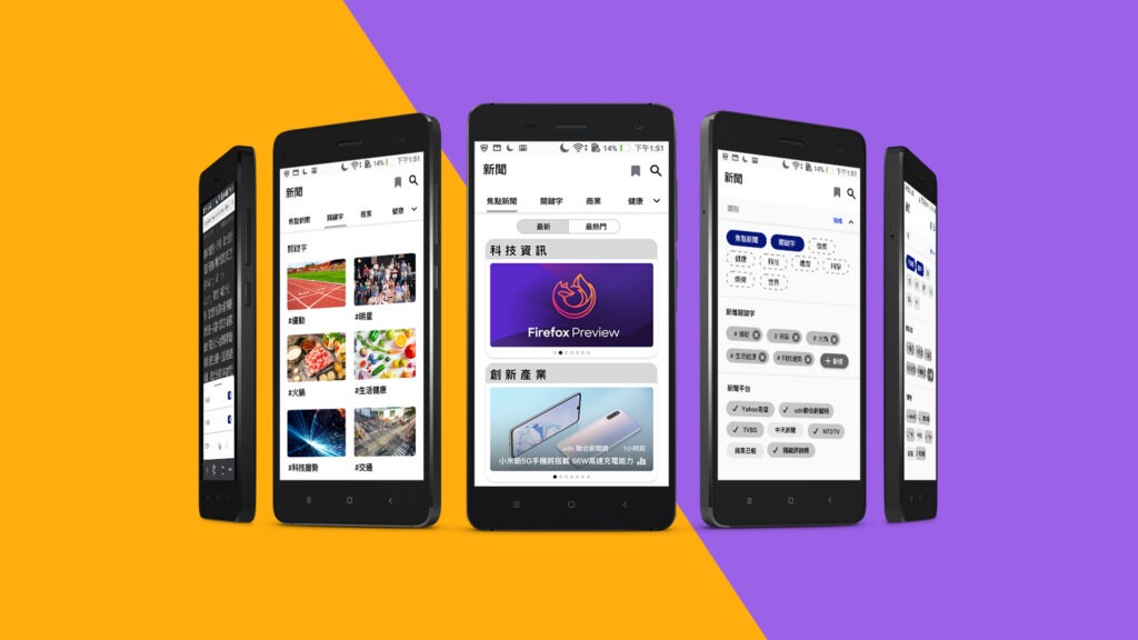
In conclusion, we have synthesized all the research findings into a total of 10 items for potential feature updates and interface improvements in the future.

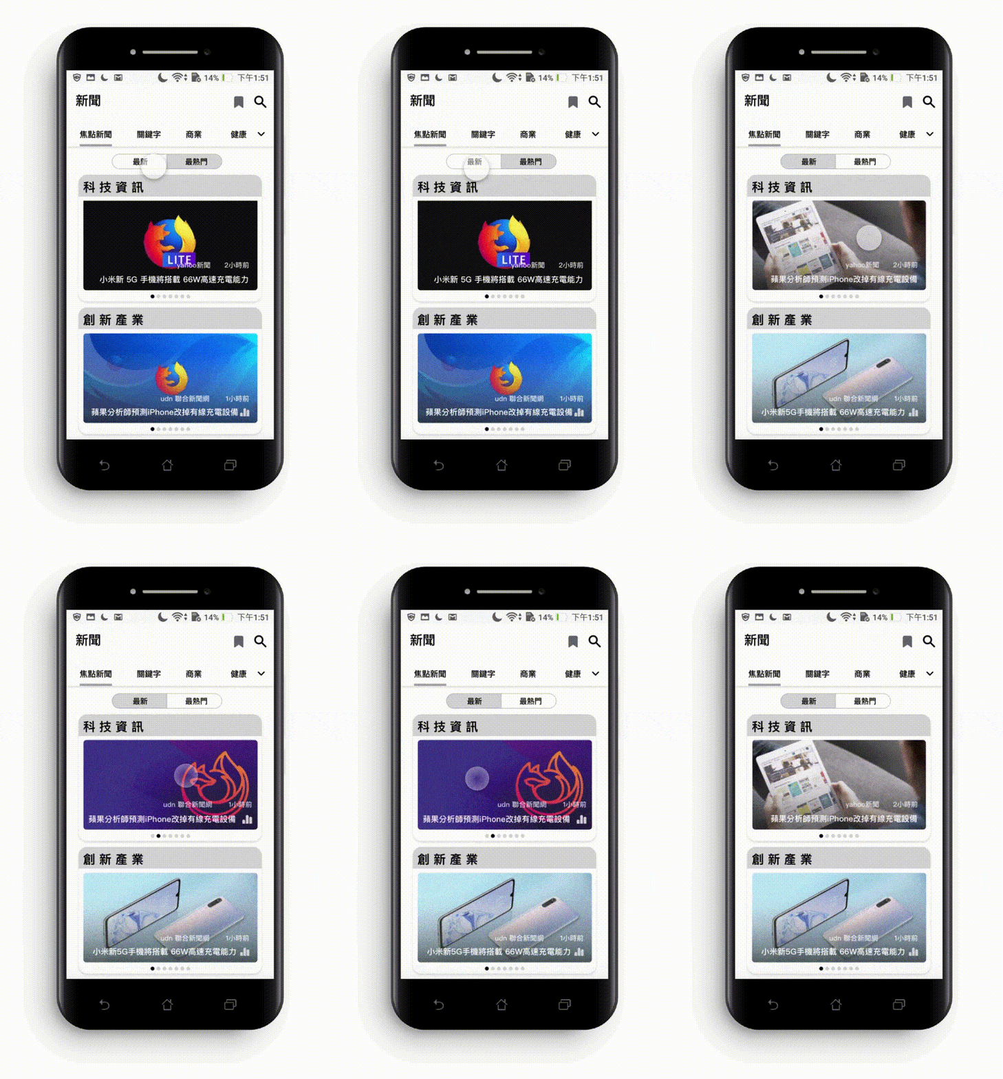
1.Sorting of news (latest news/ hot News)

Pain Point

Users can’t find the latest news and release time quickly.

2.Integrate similar topic news from different me

Pain Point

Lack of news integration.

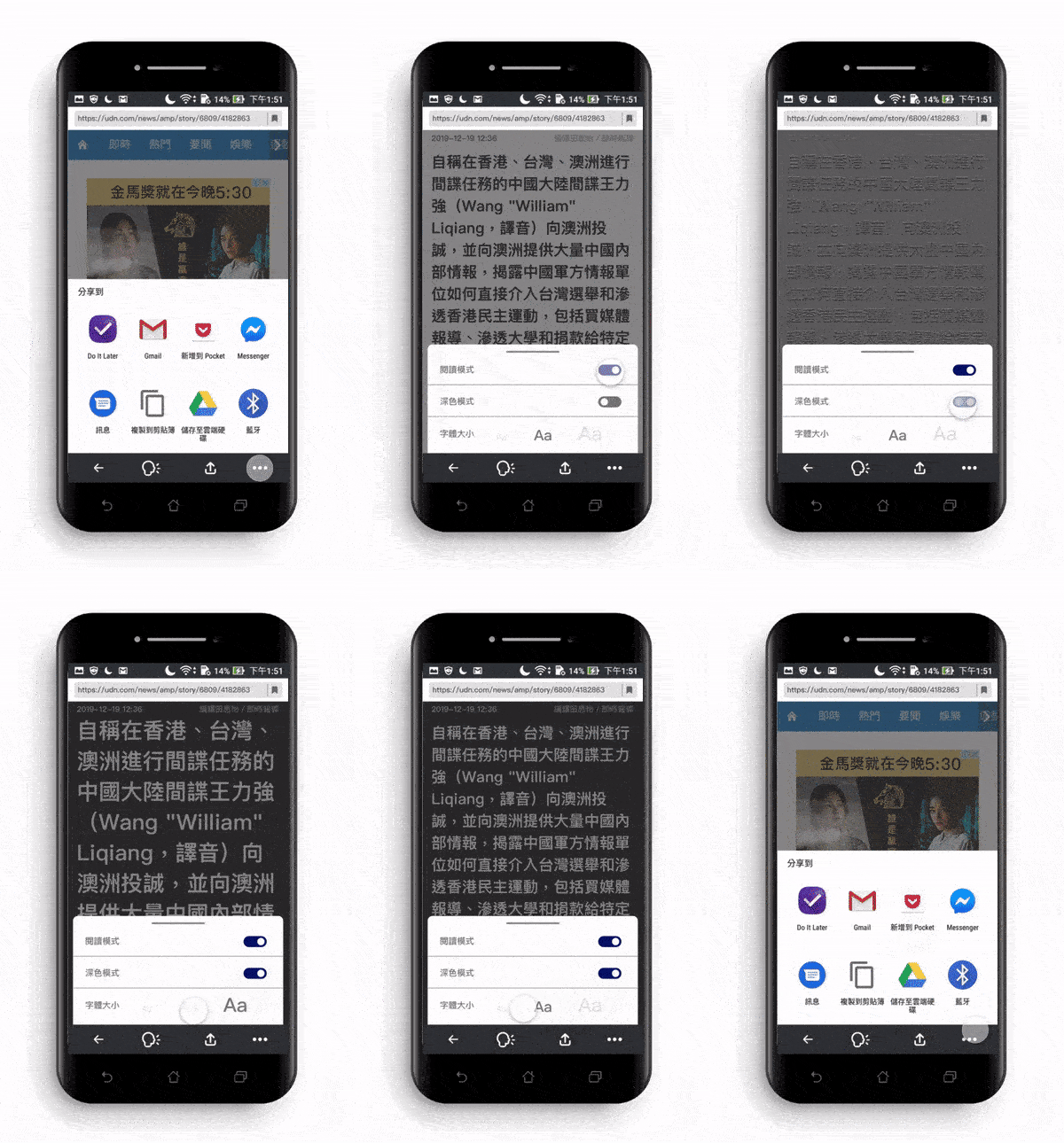
3.Font size adjustment function

Pain Point

1.Users cannot adjust the font size.
2.User’s eyes become uncomfortable due to prolonged viewing.

4.Reader view mode

Pain Point

Users are distracted by pictures and videos while reading the news.

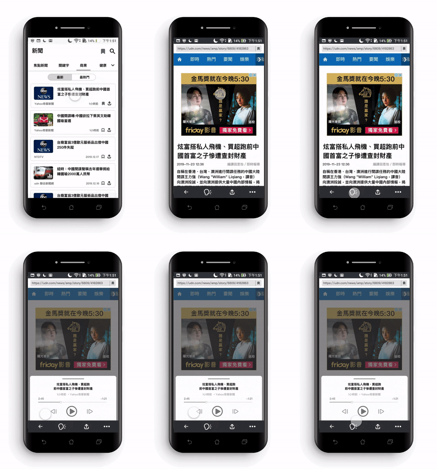
5.Listening to the News

Pain Point

Eyes discomfort cause by prolonged use of mobile phone

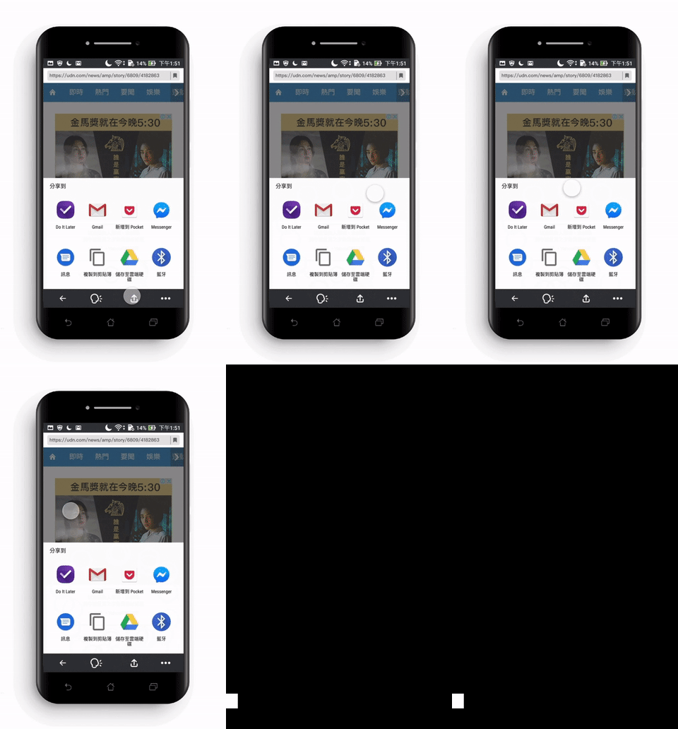
6.Sharing function

Pain Point

Users are used to sharing news with their friends and family.

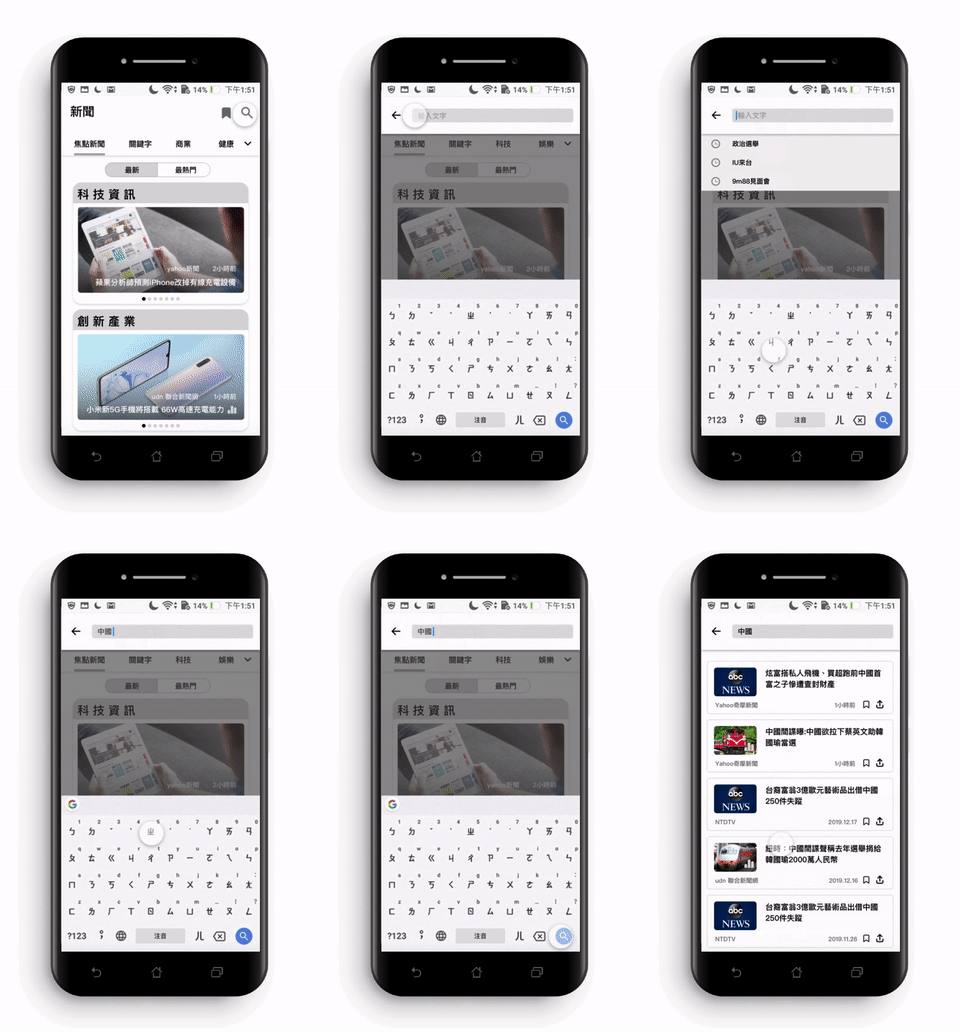
7.Search Function

Pain Point

1.Users are used to search for news by keywords
2.The design of the search function in the existing application is not obvious.

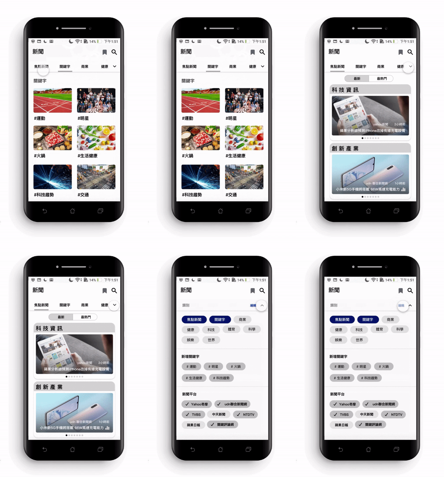
8.Customized keywords and media platforms

Pain Point

1.The news category that they are interested in are not available.

2.Users can’t follow the news that they are concerned about.

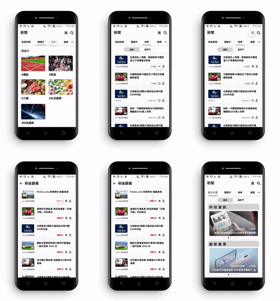
9.Watch later

Pain Point

1. The unfinished news link can’t be saved to “watch later”.

2.Apps refreshes automatically when user turns off the screen.

10.Remove refresh bottom

Pain Point【Other suggestion】

Most users are used to refreshing the page with a pull down gesture.

FIREFOX LITE

OVERVIEW

This is a Ul/UX project proposal in which my master's program collaborated with Taiwan Mozilla in December 2019. We worked in groups and assisted Mozilla launch the Firefox lite mobile app, which is mainly used by Android users. My group focused on examining the news function in the app and provided comments for improving the existing news function.

My Contributions.

➤ User Flow

➤ Wireframe

➤ User Interview

➤ Persona research

Duration.

Nov.2019 – Dec. 2019

Collaboration.

Mozilla, Taiwan

Team.

4 members.

Tools.

Adobe XD, Sketch
Target Audience

Firstly, the most prominent user age groups for this app are between 20 to 30 years old and 50 to 60 years old. Moreover, it requires operation on two different mobile platforms, namely iOS and Android. Lastly, our study included a total of 11 participants, comprising two age groups: 20 to 30 years old and 50 to 60 years old, with 6 participants using iOS and 5 participants using Android as their respective operating systems.

iOS

Android

Age 20 - 30

Pain Point

● Information homogeneity
● Unable to receive instant breaking news
● Too many advertisements
● Too many pop-up windows, operation procedure is not fluent
● Existing apps fail to satisfy users expectation
● App news is not objective (worry about political polarization)
● Unable to track news on specific topics

User Needed

● Category customization
● Browsing history
● Simple and clear interface design

Age 50 - 60

Pain Point

● Font is too small to enlarge
● Too many advertisements
● Function is not noticeable
● Information is too restrictive and narrow
● Unable to know the time sequence of news
● Prolonged screen time on mobile phones

User Needed

● Read news aloud function
● Time sequence of news release
● Font and image zoom function

Persona research

After our previous user research, we used "Persona" to establish two distinct user groups with specific usage scenarios.

Mind Map

After conducting the Persona research, we transformed it into a Mind Map. This was done to gain insights into potential issues and emotions that users might encounter during their interactions with the product.

How Might We

How might we improve the comfort and efficiency of reading News?

❮❮ -- Sorting of news (latest news/ hot News)

Pain Point

Users can’t find the latest news and release time quickly.

❮❮ -- Integrate similar topic news from different me

Pain Point

Lack of news integration.

Font size adjustment function -- ❯❯

Pain Point

1.Users cannot adjust the font size.

2.User’s eyes become uncomfortable due to prolonged viewing.

Reader view mode -- ❯❯

Pain Point

Users are distracted by pictures and videos while reading the news.

❮❮ -- Listening to the News

Pain Point

Eyes discomfort cause by prolonged use of mobile phone

Sharing function -- ❯❯

Pain Point

Users are used to sharing news with their friends and family.

❮❮ -- Search Function

Pain Point

1.Users are used to search for news by keywords

2.The design of the search function in the existing application is not obvious.

Customized keywords and media platforms -- ❯❯

Pain Point

1.The news category that they are interested in are not available.

2.Users can’t follow the news that they are concerned about.

❮❮ -- Watch later

Pain Point

1. The unfinished news link can’t be saved to “watch later”.

2.Apps refreshes automatically when user turns off the screen.

Remove refresh bottom -- ❯❯

Pain Point 【‘Other suggestion】

Most users are used to refreshing the page with a pull down gesture.